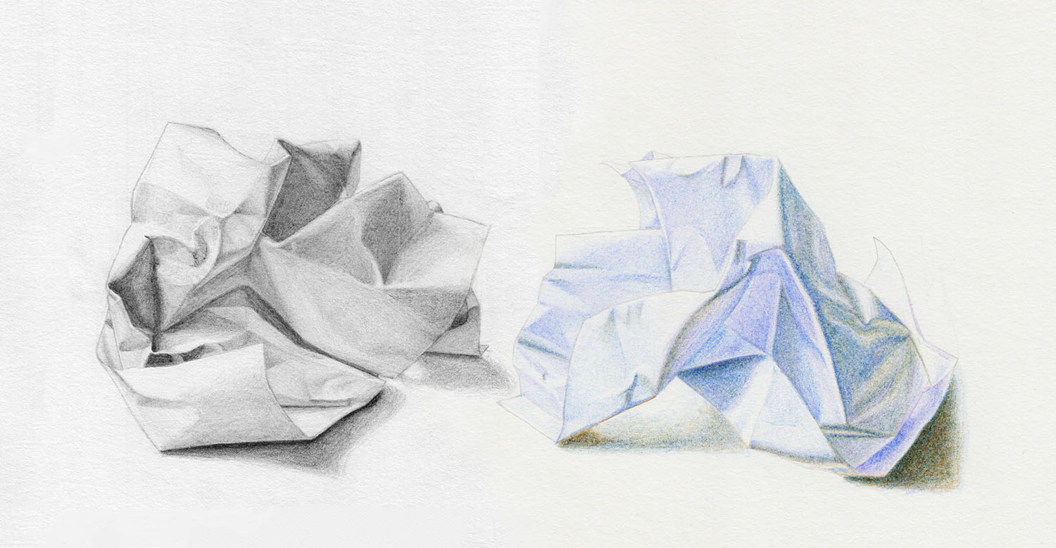
How to Draw Crumpled Paper
There is no better subject than crumpled paper to practice the basics of light and shadow and three-dimensional forms. Whether you are a beginner just starting to draw or an advanced artist, the following two exercises will help everyone learn something new.
In the first exercise, we will draw a crumpled piece of paper with a pencil, and in the second, with colored pencils. So grab your supplies and let’s get started.
Prepare Your Reference
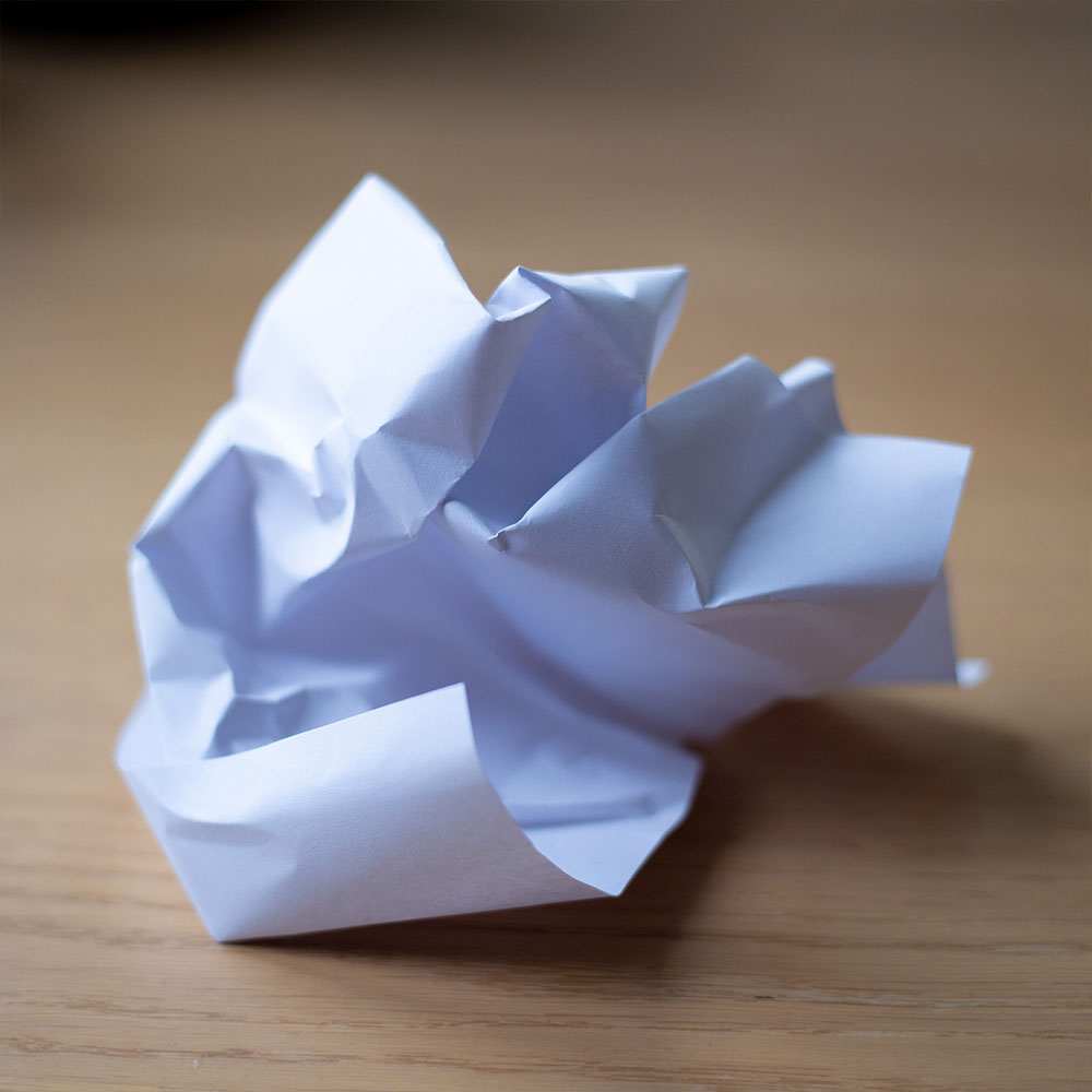
Before we start, we need to prepare our reference. Please crumple up a piece of paper instead of a photo of it for this exercise and place it in front of you. We must draw from a real object because this way we can better examine and analyze it.
Additionally, you will need a good light source that creates an interesting shadow. Perhaps the daylight in your room is already suitable, otherwise, you can use artificial light to help.
Drawing the Sketch of the Crumpled Paper
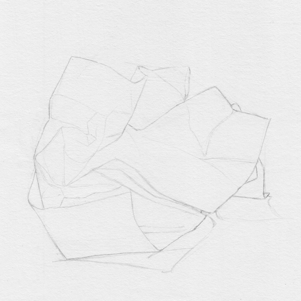
Both exercises start with a sketch of the crumpled paper.
Take enough time for this step because, besides the outlines, you should also draw some important folds. This will make it easier for you to draw the shadows in the next step as you can orient yourself by the folds.
In my sketch, I have also captured the shadow on the table, which you can do as well or skip if you are not up for it.
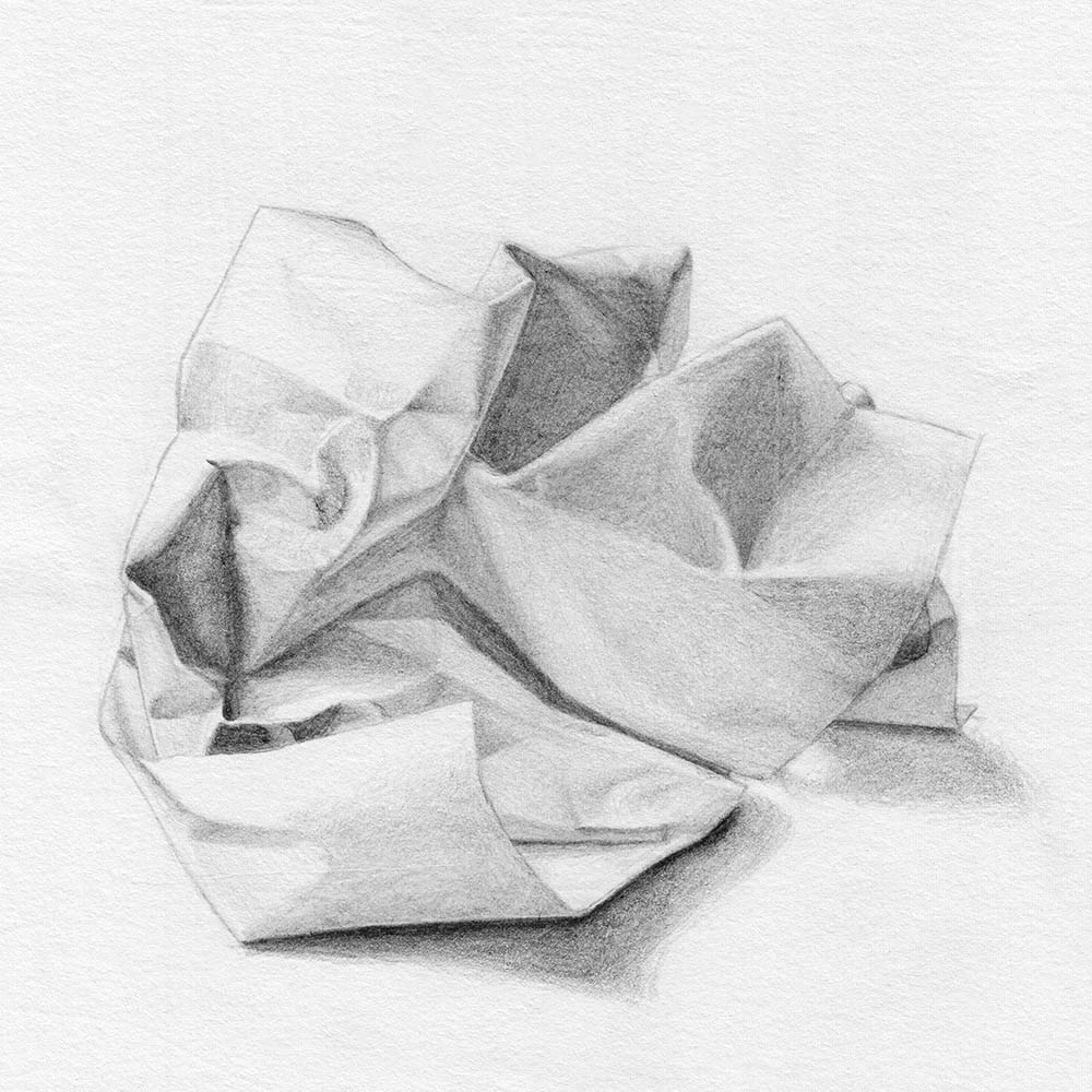
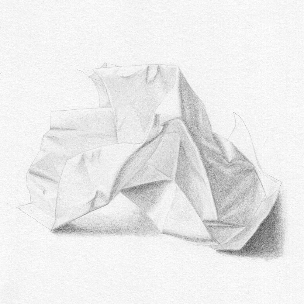
Drawing Crumpled Paper with Pencils
For this exercise, it’s best to have pencils with grades 4H, 2H, and HB. If you don’t have a 4H pencil, you can take the next hardest pencil and then add two softer grades. You can also use more than three pencils if your reference shows stronger contrasts.
Since we’re only drawing with pencils, we’re focusing only on the different tonal values (the intensity of the pencil lines). This is not as easy as it sounds because we see the paper in front of us in color. This is exactly the point where we will learn to transfer what we see to our paper differently.
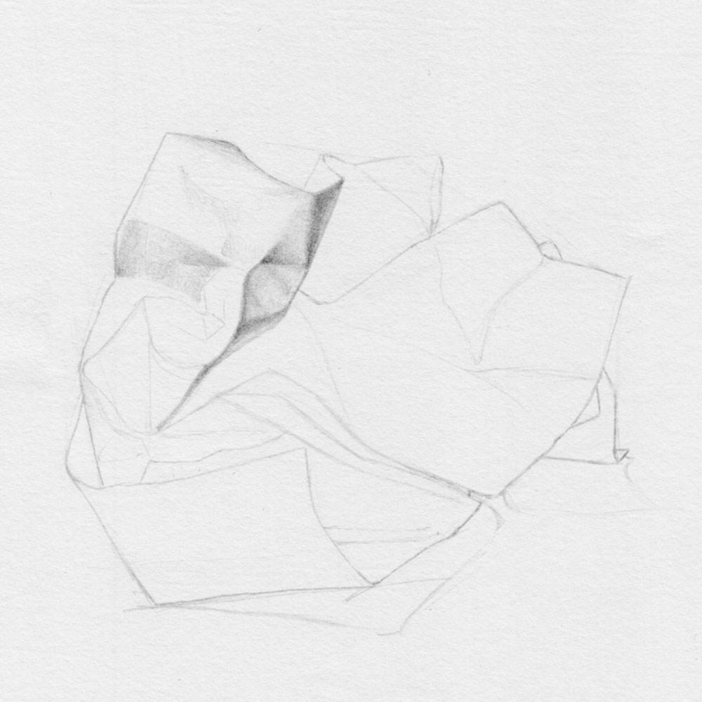
You may feel a little overwhelmed at first. How do you keep track of all the shadows and folds? Take your time and divide your paper into individual areas that you can work on one by one.
In my drawing, I started at the top left and worked my way slowly to the right. The exercise can also be repeated with different hatching techniques to reinforce them. I chose circular hatching to draw particularly soft transitions.
Drawing Crumpled Paper with Colored Pencils
In this exercise, we only use the pencil for the sketch, where we draw outlines and prominent edges. When we are done, we put the pencil far away and draw exclusively with colored pencils.
Before we start, take (at least) 5 minutes and try to identify the individual colors on your reference. Surprisingly, a simple white paper’s shadow can contain a lot of different colors.
In my case, I see a light blue and a light lavender in the shadows. However, my brown desk reflects light on the paper, so a light brown color is also part of the dark shadows, especially on the right side.
Once you have identified the different colors and found them among your colored pencils, start with just one color. Similar to the exercise with pencils, we now focus on how intense this one color is represented in the different areas of our reference.
In my case, I don’t see the light blue in the right part of my crumpled paper, so I’m not using it here for now. However, if I’m wrong, I can still add the blue later.
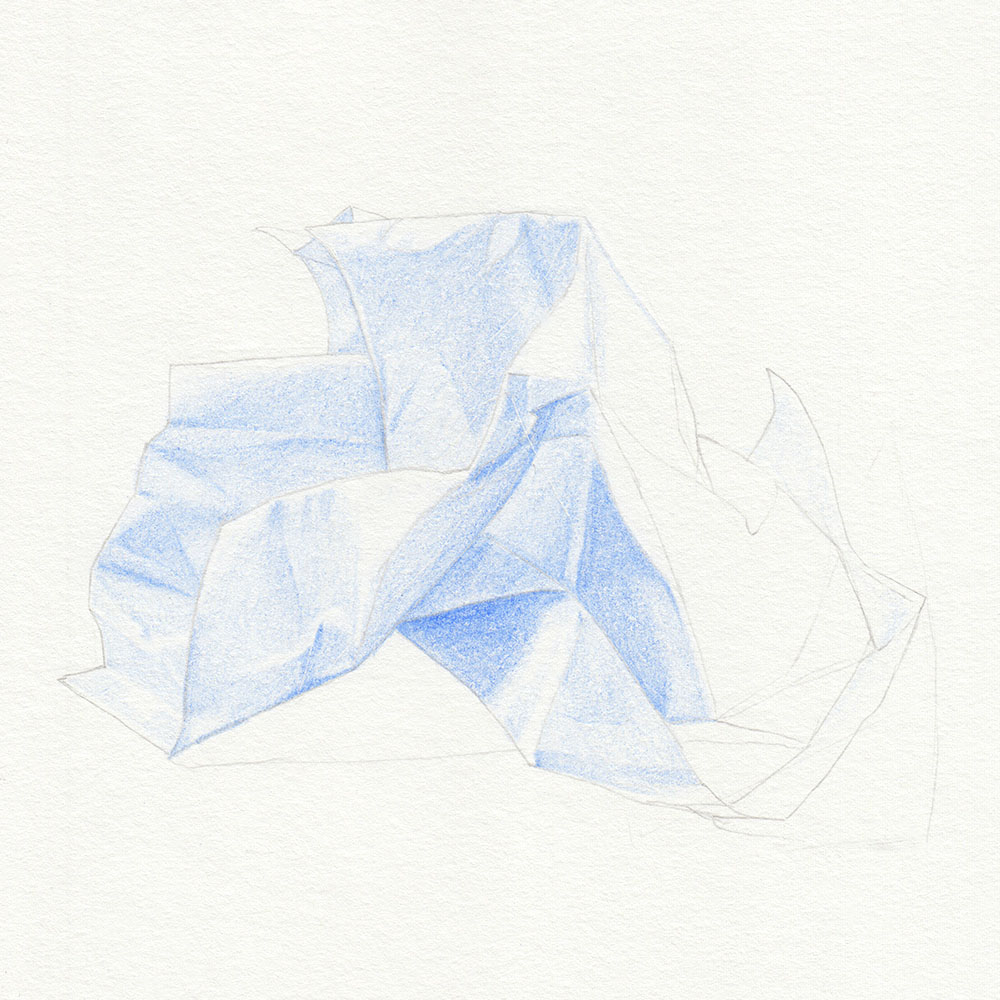
Once you are done with the first color, it’s time to repeat the whole thing with the next.
You will quickly notice that the second color already makes a big difference. Even if you only apply it very lightly, as on the left in my example drawing, it gives the drawing much more depth.
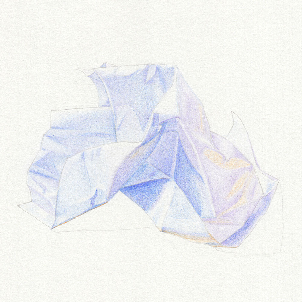
By the way, it’s not at all bad to go back to the first color in this step and fix things. This exercise is not about getting everything perfect right away, but about correctly estimating colors and depths while drawing.

In the next step, things get odd in my drawing: as soon as I drew the brown parts, the light-dark contrasts are missing and making everything look pretty flat. But that’s not a problem, as I will bring them back with the next colors.
If something similar happens to you, don’t let your art confuse you. Drawings with colored pencils often look strange during the process.
I’m pretty sure I see a touch of green in the shadows of my crumpled paper. Probably because of the blue tone and the reflected brown light, maybe my eyes are playing tricks on me.
Nonetheless, I decided to mainly include the green on the right but add it scarcely in a few shadows on the left as well.
The right side is now ready for the final color layer because what I have drawn so far works only as undertones.
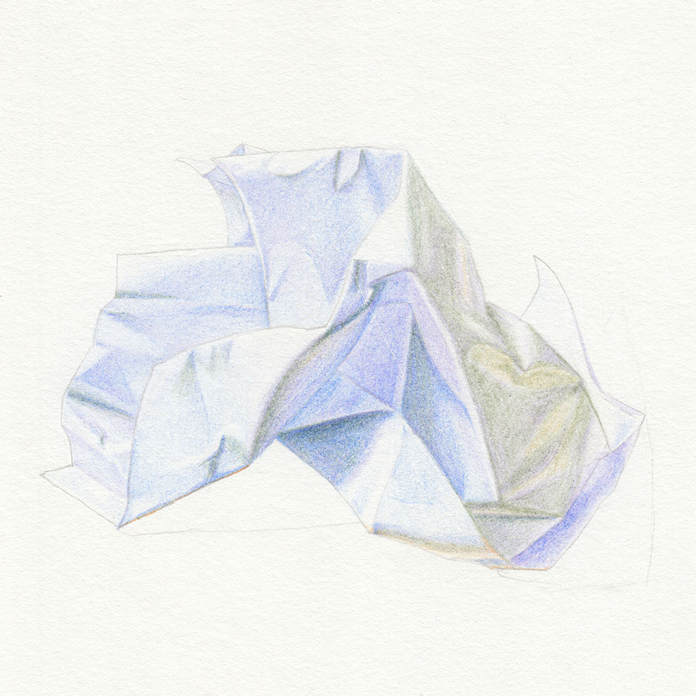
The last color is blue again. And it’s the same shade of blue that I already used for the first shadows.
In the end, I decided to add the color to the shadows on the right, because without it the right side looks too warm and too bright.
These are the decisions (or changes of decision) that you will likely make while implementing this exercise and from which we can learn a lot.
It’s important to identify and implement different colors in different tones at the end of our drawing.
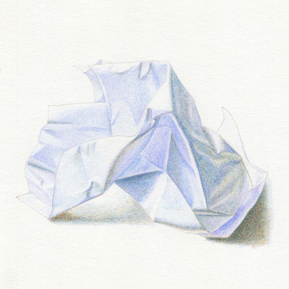
If you like, you can take a photo of your finished drawing at the end and put a black-and-white filter over it. This way, you can analyze afterward how you implemented the shadows and brightness.
I would recommend doing this only at the end. This way, you do not become dependent on such hacks during the drawing process and truly learn how to see it for yourself better.
Similar Posts